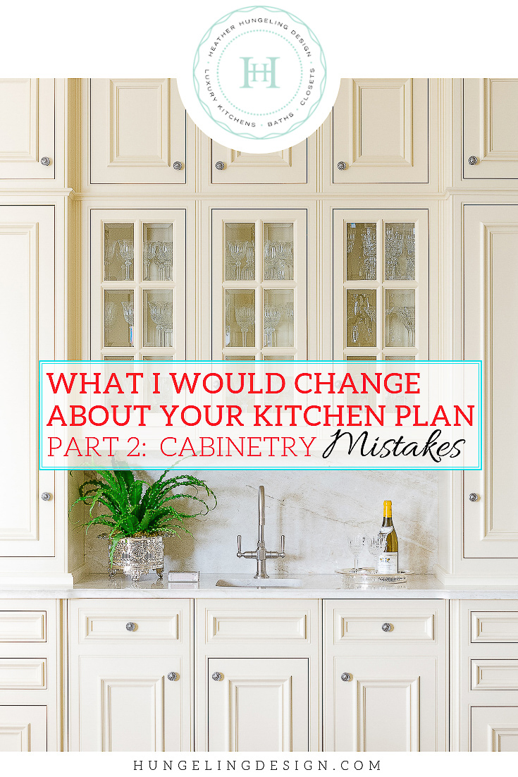
What I Would Change About Your Kitchen Cabinetry Design
KITCHEN DESIGN MISTAKES: PART 2
Hello everyone! Wow, this past week flew by so fast. I’m just back from Las Vegas where I walked my legs off at one of the country’s largest conventions, The Kitchen and Bath Industry Show. I discovered so many amazing new products, which I can’t wait to share with you over the next few weeks.
In the meantime, I’m glad you’re back to read Part 2 of my Kitchen Design Mistakes series! If you didn’t catch it, my last post was about Kitchen Layout Mistakes that people tend to make in the early days of working out their rough plan with their architect. In this week’s post, I’m addressing mistakes that people make in regards to their kitchen cabinetry design.
A little disclaimer here…I’m hoping that you’re reading this while you’re still in the baby stage of developing your kitchen plan. I certainly don’t wish to offend anyone with my opinions, because that’s what they are - my opinions. Ask ten kitchen designers about their opinion on something, and…you’ll likely get ten answers. We have each developed a particular outlook that adapts to our clientele’s needs, as well as to the scope of our projects. My specific opinions have been honed through that lens.
Regardless, it’s always beneficial to hear someone else’s opinion…especially when it’s freely given. So here you go…a rundown on the top “mistakes” that I see others make with their kitchen design:
Kitchen Cabinetry Design Mistakes
1. GETTING ROLL-OUTS INSTEAD OF DRAWERS
Source: Heather Hungeling Design | Willow Lane Project
Roll-out shelves certainly offer a convenience. Although we call them roll-out shelves, in truth, they are often made exactly like a drawer box (with sides to prevent items from rolling off). They are very handy for accessing objects that would typically get buried in the back of the cabinet. Nobody wants to kneel down and have to dig through a base cabinet like it was their grandmother’s kitchen! However, I think some people get on board with this idea without realizing that there is often a better solution…drawers.
With a drawer, there is only one movement required. In contrast, consider that with a roll-out shelf, you have two motions. 1) open the door and then 2) pull out the roll-out. If it’s a double door cabinet, then you have the added nuisance of needing to open both doors. So that doesn’t make sense from an ergonomic standpoint! Why do two movements when you can do one?
Depending on the cabinet maker, a unit with drawers may still be a bit higher than one with the same number of roll-outs. However, the added inconvenience day in and day out makes the roll-outs a lousy deal. In the kitchens that I design (image above), easily 90% of the base cabinets will be drawers. In fact, there is little need for anything else. With drawers that come in varying heights, you can accommodate almost anything. In the few instances that I do need to specify a cabinet door unit, there is usually a special reason (i.e., a corner cabinet, a pull-out trash, etc.). Occasionally, I will do it just for the sake of symmetry.
2. USING AWKWARD SIZED WALL CABINETS
Source: Heather Hungeling Design | Wentworth Place Project
There are two sizes of wall cabinets that I try very hard to avoid…a 24” wide cabinet and a 28” wide cabinet. These two sizes represent most manufacturer’s size limitations as they shift from a cabinet with one door to a cabinet with two doors. As a cabinet maker moves from a single to a double door unit, they enter an awkward zone.
Most cabinet makers will max out a single door wall cabinet at 24”. Anything wider than that runs a higher risk of warping. If you were to use a 24” wide cabinet, you have a nice big wide door with great accessibility. However, a 24” wide cabinet almost always looks very wide and squatty on the wall. You lose the elegance and refinement of your cabinetry, no matter how much you pay for it.
Conversely, with the 28” cabinet, you are too wide for a single door and just barely wide enough for a double door cabinet. Assuming a standard frame size, your doors would then be approximately 12” wide. The narrow doors on a 28” wide cabinet make it very difficult to access the interior and just looks poorly thought out. If your other wall cabinetry is nicely proportioned, then these choppy sizes will stand out like a sore thumb.
In contrast to those awkward sizes, take a look at the image above. The glass cabinets are comprised of a double-door unit and a single-door unit (making up three doors). The single-door cabinet measures 18” wide and the double-door cabinet measures 36” wide. I actually try not to go any narrower than this. At this width the wall cabinets will still look nicely proportioned and elegant.
3. NOT PANELING THE DISHWASHER
Source: Heather Hungeling Design | Julep Lane Project
This is actually a big pet peeve of mine. Please, please panel your dishwashers. They are not pretty appliances and the break up the visual continuity of your base cabinets, which just makes your design look busier. By having them be stainless steel, they just draw your eye to them.
Can you imagine the kitchen above with a stainless dishwasher between the two sinks? It would just be a big sore thumb sticking out into an otherwise lovely kitchen.
Since the dishwasher is one of the least expensive appliances in your kitchen, it does not add considerable expense to upgrade to a unit that will accept a panel. I’m very fond of the Miele fully integrated dishwashers, which always get rave reviews from my clients. Asko and Bosch are two other brands which I use as well.
4. NOT UPGRADING TO FLUSH-INSET CABINETRY
Heather Hungeling Design | Wentworth Place Project
If you’re trying to create a high-end, luxury kitchen, then you are entirely missing the boat if you don’t do flush-inset cabinetry.
I had clients once that were building a 20,000 square foot dream home. Like a lot of people, they didn’t know the difference between flush-inset and overlay. They had put a deposit down for all of their cabinetry through a national, well-known showroom. This showroom only represented brands that offered overlay door styles of cabinetry. So, of course, they didn’t point this difference out to the client!
It was the clients’ tile installer, who was doing a lot of elaborate work on the house, who then pulled the client aside and said: “hey…you know, for a house like this, you really should have flush-inset cabinetry!” Man, I loved that guy. That tile guy was the catalyst for me getting a rather large “do-over” job.
If you’re not familiar with the difference, study the image above. A flush-inset cabinet will have the doors inset and flush with the surrounding face frame. In comparison, overlay doors will sit proud of and will slightly overlap the surrounding face frame. The former requires a lot more skill and precision to craft and is, therefore, more highly regarded.
In my opinion, if your home is worth over a million dollars, you should be looking at flush-inset cabinetry. It looks bespoke, high-end, and bench-made. Overlay looks utilitarian and whispers of off-the-shelf cabinetry.
5. MAKING YOUR KITCHEN TOO BASIC
Heather Hungeling Design | Wentworth Place Project
I can’t tell you how many times I have proposed something unique or special in the original presentation that the client loved, only to have them want to eliminate it at the last minute out of fear. Sadly, many kitchens fall victim to this Plain Jane syndrome.
The greatest fear most clients have is of doing something that will instantly date their kitchen or that they will regret later. Unfortunately, many people actually end up regretting that they made their kitchen a little too…vanilla, so to speak. It’s OK to begin with a foundation of vanilla, but then you’ve got to take a deep breath and add some sprinkles!
Here’s my advice for adding character to your kitchen without regret:
Pay attention to the trends, even if you don’t wish to do anything “trendy,” because being utterly ignorant of the trends may lead you to inadvertently choose something that’s on its last breath in the popularity cycle. Check out this popular post I wrote about Kitchen Design Trends for 2019 - The New Traditional Kitchen.
Select cabinetry details that are in harmony with the architectural character of your home so that they will always be relevant to your home, regardless of whether they are trendy. In the kitchen below, I added arched glass cabinets on either side of the range to evoke a Georgian feel to the design, which was appropriate for the design of the home. I also added circular molding to the end panels of the island and repeated that element above the range. You might wish to read my 3 part series on adding beautiful details to your cabinetry…start with Part 1: Pretty Interior Cabinetry Details.
Choose details that are classic or timeless, but still brimming with style. For instance, if budget allows, bring in a beautiful Cornu Fe or La Cornue range in a deep blue or elegant black. It will never go out of style and will add loads of character! Ceiling beams, a stately cased opening, reclaimed hardwood floors, are all other examples of introducing texture and interest in non-trendy ways.
Avoid implementing trends in anything costly (such as the cabinetry) unless you have a plan on how you can easily update it later. See post about The Black Kitchen Cabinetry Trend (and how to make sure you’ll be happy five years from now).
So did you survive my list without cursing me? I certainly hope you’re not reading this right after you completed your kitchen renovation only to find you hadn’t considered a few of these “mistakes.” My intent is to educate you so you don’t have any regrets later!
If you are planning a remodel soon, you really need to subscribe below. Not only will you get access to my Luxury Resource Library (for all things kitchen & bath), but you’ll be notified when I publish the next (and final) post in this series.
You don’t want to miss the next one because I’m going to share some advice about choosing a countertop material. All too often, people make the mistake of settling for something ugly because they want durability. Well, I’ve got some exciting new products and discoveries to show you that will amaze you (including real marble that doesn’t stain or etch!!!). I’ll also be updating my resource library with some of these new resources over the next few weeks.


