10 Inspiring Range Hood Ideas
As a kitchen designer, I am always on the hunt for inspiring kitchen range hood ideas. For every kitchen that I design, I look for an opportunity to inject a unique personality into the kitchen. While it doesn't always need to be the range wall that makes a distinct statement, I find that it is the most natural place to start.
When I first begin to work with a client, the brainstorming aspect of the design usually takes the longest for me. I feel compelled to leave "no stone unturned" as I sort through the ideas in my head. I frequently have a direction in mind as soon as I see the space in person, but there are infinite variations on that direction and thinking them all through takes some definite brain juice. So it helps me to sort through these images in my head by having some serious inspirational images in which to turn. I hope you'll find something to inspire you as well in this collection of custom range hood ideas.
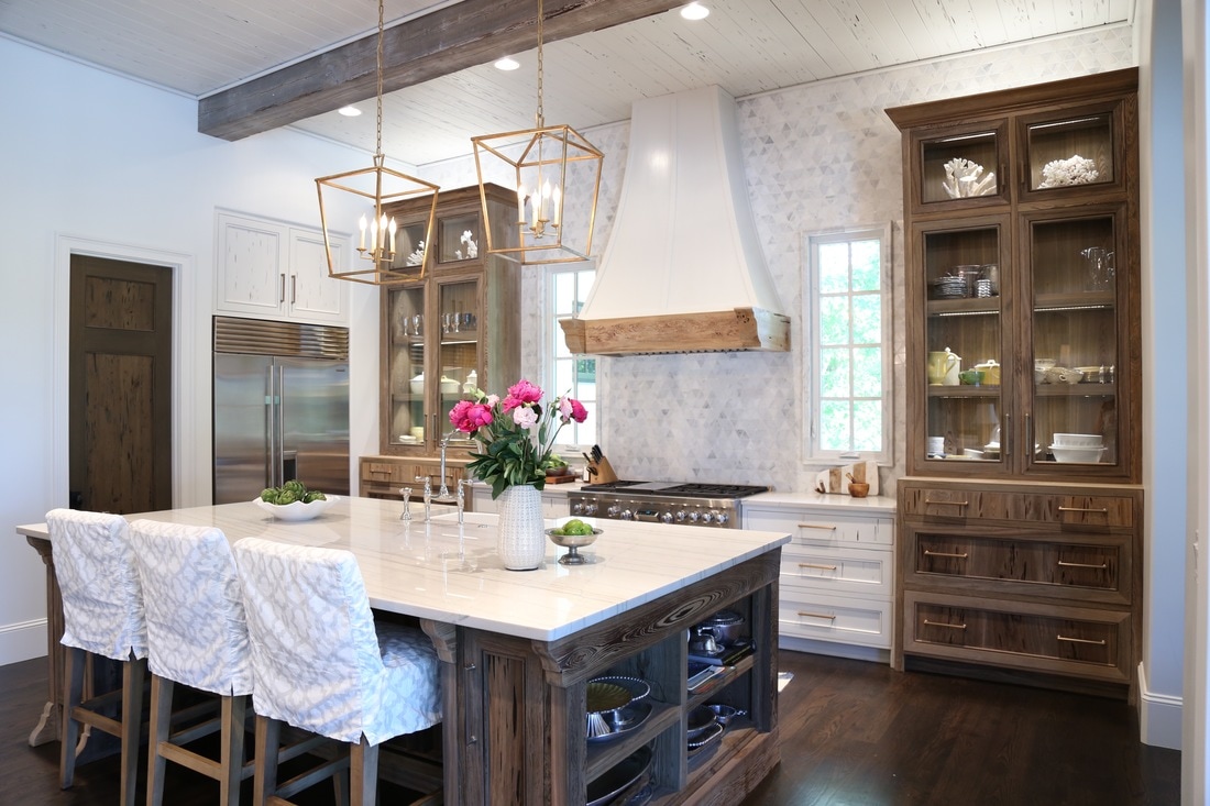
1. First up is this pretty little number from Old Seagrove Homes. This is becoming a signature look for them as they have used the same hood style in several of their properties lately. In this one, I like the two-tone nature of it, the height, combined with the gentle sweep of the chimney breast. I also love how they picked up the same wood finish on the two tall side units that flank the range...and that they managed to squeeze some pretty little windows in there to boot.
Range hood design for a modern farmhouse, combining white panels with the rustic warmth of the wood trim.
Source: Old Seagrove Homes
2. Next up is of a special place that you may have seen around the web...Patina Farm. This place has been featured a lot and for good reason. It's a great example of how to take some rustic and country elements and then apply a cleaner aesthetic to it with the smoother finishes of the cabinetry and the simple styling of the light fixtures and bar stools. There are so many lovely details to appreciate in this space, but I have always been particularly fond of the way in which they gently scooped out the hearth above the range and how the corbels are so simple that I hesitate to even call them corbels. I also love how they used the stone only on the inside back wall of the hearth. Most people probably would have reversed this and used the stone on the outside thinking they needed all of that texture, but it's really special and quite authentic looking, while still looking like someone modern lives here.
Patina Farm masters the texture game by combing a smooth plaster kitchen hood design with a beautiful stone backsplash.
Source: Giannetti Home
3. You can't go wrong with rustic textured beams and a lovely stone "hearth" above the range. This look has made the rounds several times over the years, but this one looks quite good now. I think it's because they were restrained in the color pallet used for the stone and then combined it with a more updated finish on the island. This designer has an outstanding portfolio of projects with a Mediterranean/Country French design. If this is your cup of tea, you absolutely must view the rest of the home related to this kitchen.
This hood design simply showcases a lovely stone with a simple arch over the range.
Source: Carolyne Ferguson Design via Hello Lovely
4. Next up is a cast stone hood by Francois and Co. that I used in a semi-outdoor kitchen in Florida. These have been around for a while, but I think the trick to making them look relevant today is to keep them really simple and clean. In this kitchen, the width of this range hood makes it a dramatic focal point.
Cast stone range hood designs can be dramatic when the details are simple, but the scale is large.
5. This range hood brings to mind Helen of Troy for me! She is so beautiful and classic. The patina and detail on this nickel silver hood launched a huge project for me last year. We ended up designing a ten-foot wide hood in a similar style and literally built the whole kitchen around it. I particularly love how it's capped at each end by end panels of the surrounding cabinetry as well as the tailored panel shape of the marble backsplash.
A nickel silver hood design looks stunning with white calacatta marble backsplash.
Source: Obrien Harris
6. This kitchen that I recently designed really reflected the historical nature of the home as well as its Georgian architecture. The cabinetry had so many pretty architectural details that the range hood needed to be pretty clean and classic. This idea was really born from a fireplace mantle of that period. The entire "chimney breast" was paneled with millwork and the circular detail on the panel centered above the range hood played well off of the Georgian arched glass cabinets on either side.
Tailored wood mantle range hoods have an important role to play in traditional design, especially when working with historic homes.
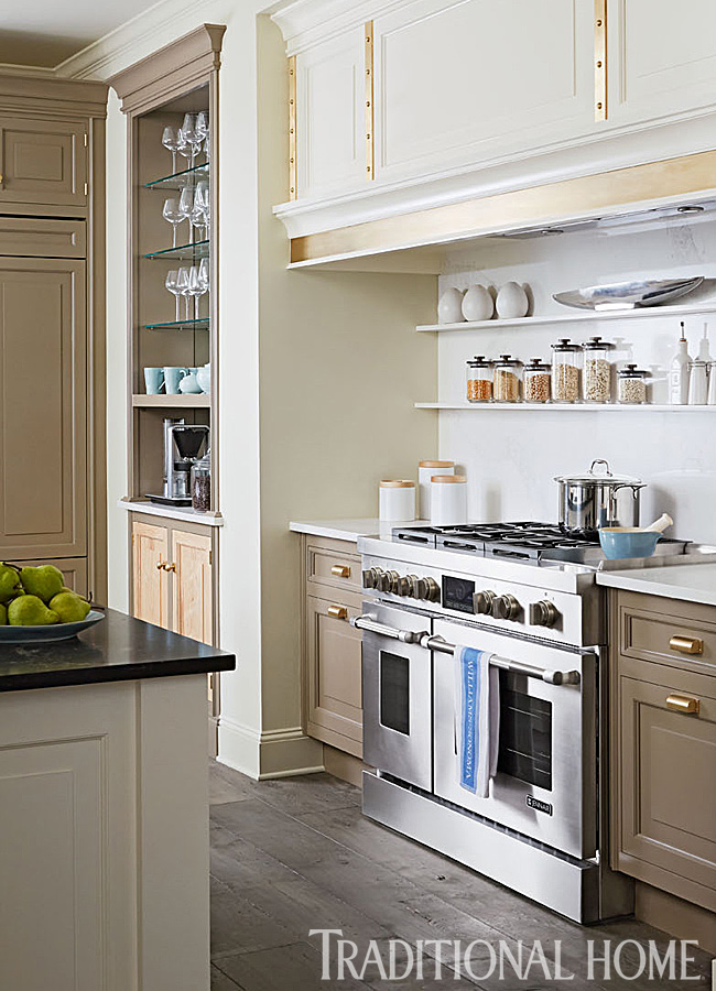
7. This kitchen was designed by Christopher Peacock for the 2015 Lake Forest Showhouse & Gardens in Chicago. There are lots of details to love in this space and I find myself discovering new little secrets in here every time I study the image. I love how they used the metal accents on the range hood. Although they used a fairly classic paneled shape to the range hood, they really stepped it up a notch with the application of the brass riveted trim and the horizontal banding. Christopher Peacock uses metal and hardware brilliantly in his designs. In fact, I think the hardware is really his true calling. His cabinetry often plays second fiddle to his hardware.
A simple paneled range hood design featuring brass accents. A classic and works in almost any style of home.
Source: Christopher Peacock via Traditional Home
8. I think this is a great take on a wood hearth style of range hood for a farmhouse kitchen. The gentle arch is really pretty and pleasantly unexpected. The corbels are streamlined and suitable for a wide range of styles. The wood, of course, looks really sharp against the shiplap wall. Depending on how textured you go with the wood finish, this could work really well in a more rustic farmhouse look or a modern farmhouse. I'm further intrigued by the marble backsplash...it almost looks like the panels slide open for concealed access.
A creative range hood design perfectly suited to the modern farmhouse vibe, showcasing the beauty of the wood mantle against crisp white shiplap paneling.
Source: Sherry Hart Designs
9. Now this one has really made the rounds on Pinterest. The cabinetry is quite straightforward really. The designer just added the detail of little scalloped corners on the wall around the cabinetry and voilà...something magical emerged. This one cool architectural feature carries the whole kitchen. Everything else is restrained and minimalist.
A cool, modern range hood design that features a very unique idea.
Source: Dana Wolter Interiors
10. Most of my clients tend to have fairly large kitchen spaces, so I'm always trying to come up with ideas about how to provide an appropriate scale for the range hood. In this Napa Valley home featured below, the interior designer/homeowner didn't shy away from making several grand statements. While the cabinetry remains very simple everywhere else, the 60" La Cornue range gets a Chateau style range hood. While most people probably would have shied away from displaying anything above the mantle, this designer really nailed it with the display of taxidermy and the shield. A bold choice, but it really enhances the character of the range hood.
A chateau-style mantle range hood idea perfectly suited to the Napa countryside.
Source: Hillary Thomas Interiors and Traditional Home


The black kitchen cabinets trend is still going strong. I'm hoping that it's going to have some staying power because it's such a lovely foil to the most classic color of all time...white. It adds depth to any room it’s in and looks fantastic with lots of different wood tones. However, the "wall to wall" black kitchen cabinet look that is so popular now, will not last. You need a plan of action to implement this trend that meshes well with your wallet and your sensibilities(…)