How to Make the Most of a Long Kitchen
Hello everyone! The project that I'd like to showcase today illustrates some great tips on working with a long kitchen. It can be really challenging trying to marry the two far ends of the room together in a really long space, while keeping it functional and visually appealing at the same time. If you are struggling with a long kitchen space in your own home design, this post may help you quite a bit.
This kitchen is located just outside of New Orleans and was done shortly after the home had taken substantial damage from a hurricane. My clients brought me in on this project after they had hired a contractor and had already gutted the interior of the home. They were working with an architect as well, but everyone was struggling with how to make this kitchen look good and work well for the family. My client's goal in beginning the remodel was to really open up the kitchen space, but once all of the walls came down (shy of a few structural columns) it actually created a different design dilemma became the space became a bit too big. I have to admit...this was one of the most difficult kitchens that I've ever tried to "organize" due to it's long shape. However, the results were well worth the effort because it remains one of the kitchens that I'm most proud of in terms of making it all functional while still maintaining the aesthetics and scale of the room. While it's not unusual to see a luxury kitchen include the use of two islands nowadays, good design is still essential to maintain a cohesive feeling, . Here are a few space planning and design tips that can help you to make the most sense of your long, open kitchen shape.
Tip 1: Create a large and dramatic surround for the range area.
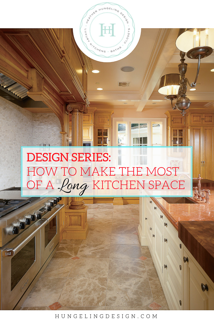
It will help bridge the distance between the two far ends of the room. Here I used a classic columned surround that was well suited for the home's traditional architecture. I scaled everything to be quite large so that it seemed proportional to the length of the room. That meant a really large custom hood over a 60" range. I literally tried to make the range surround as wide as I could. To help the visuals on this wall along even more, I also employed the use of one of my favorite Old English concepts - a Crockery Cupboard (seen to the left of the hood surround). Inside of this pantry style tall cabinet, special glass fronted drawers housed a collection of Le Creuset cookware and other bakeware. My clients loved the fact that all of these large pieces now finally had a dedicated home.
The stately columns on this large hood surround help to balance the length of the room. Cabinetry by Clive Christian. The wood cabinetry is managed growth oak from France, which gives it a very different look to the busier oak we have here in the U.S. The painted cabinetry is Linen White.
Tip 2: break up a long island with varying counter top heights or surfaces
But to prevent it from being so long that we couldn't find a single marble slab large enough, I added some lovely iroko chopping blocks at each end. (I also think its important to visually break up the island when it gets really long. However, I like to keep things pretty symmetrical in a big kitchen, otherwise it looks a bit chaotic and busy.) Not only do the chopping blocks provide a great place for food prep, but they also provide some visual balance to the large hood surround.
A second island is oriented the other direction and serves an entirely different purpose than the main island. It fills the length of the room without becoming an impediment to the flow of the kitchen.
Tip 3: Use a second island and give it a different shape and function.
I added another small island at the end to balance out the room. In order to keep it feeling purposeful, I dedicated it to the task of entertaining. A small trough sink, an ice maker, and refrigerator drawers that housed beverages made a perfect place for guests to help themselves without getting in the way of the cook. The clients particularly liked that their children could dash inside from the pool quickly and not drip water all across the room.
Only a few steps away sits a pretty little walk-in refrigerator pantry. Sophisticated details and glass cupboards help to draw your eye into this space, thereby creating additional depth to the room. Here, the homeowner has access to multiple refrigerators that would have been difficult to position with limited wall space in the main kitchen.
Tip 4: If there isn't enough room on one wall for all of the big items (range, refrigerators, pantry, etc.), then use your space creatively!
This decision may seem a little out there for some people, but it actually worked really well. My clients loved this! Since they had a large family, they really wanted to have more than one refrigerator. Since multiple refrigerators on the same wall with the range would have been impossible, I carved up the client's pantry. I divided what was initially a long rectangular food pantry into two distinct rooms...1) Refrigerator Pantry (at least that's what we called it) and 2) the Food Pantry. We made the opening width generous and drew your eye into the room with beautiful cabinetry details. Although this may be an unconventional idea, it really only increased the homeowner's steps to the refrigerator by a few feet. I also off-set this by adding more refrigerator drawers to the main island so that frequently used items were also right next to the prep area. In the Refrigerator Pantry, we actually ended up using three of the 27" Sub Zero fully integrated series, along with additional cabinetry for storing other kitchen items and counter top appliances. We created lots of extra counter space in here as well, which is really a nifty idea if you love having lots of counter top appliances but don't like to have to dig them out from storage all of the time. This way, the homeowner can walk right into the little Refrigerator Pantry and use the food processor, slow cooker, etc., but not have to clutter all of the counter tops in the kitchen. I'm often asked for tips on luxury kitchen design and the concept of dedicating storage for all of the counter top appliances is definitely on the top of my list. No one likes the way that stuff looks sitting out in the kitchen, but we all love having it easily accessible!
Tall elements flank the window and balance the heaviness of the hood surround.
Tip 5: Make the short ends of the room work extra hard.
If your space is long and narrow, but still open to a family room, then you probably have very short perpendicular walls on which to place other significant items. On this particular project, one end of the room was all windows and looked out at the swimming pool. The other end was then the only other wall on which to put any cabinetry. I generally like to have a dedicated "cleaning" area in a kitchen if possible. If there is room for a sink in the island, I generally find its best to make that a prep sink and keep it clear of dirty pots and dishes that may accumulate throughout the day. So having a window with a large sink under it was the way to go in this kitchen. We flanked it with pilasters that maintained the classical architecture of the home, but also made them pull out to hide dish towels and cleaning items. A pull-out trash and concealed dishwasher were symmetrically placed on either side of the pilasters. Then I packed even more function into the space by flanking the window with an oven/microwave/warming drawer combo on one end and a cool "breakfast pantry" on the other. If you've read some of my other posts, you will know that this is a popular concept for my clients. I like to use a pantry or larder style of cupboard which opens to reveal another small counter space with drawers below and shelves above. Clients love to house their coffee makers in them and then outfit the entire cupboard with items specifically used for breakfast, such as toasters, and blenders, etc.


No matter how great every other detail of your future dream kitchen is, you won't be truly happy with it unless you adhere to this list of important characteristics. It’s a little bit like selecting a future spouse…you’ll want that person to have good character, respect your need for space, be steadfast, neat as a pin…