The Secret Recipe For A True English Kitchen
INSPIRATION FROM ACROSS THE POND
I’ve worked with English kitchen manufacturers for most of my adult life. Doing so has even required that I learn the British jargon related to this industry. For instance, my British colleagues would say “dado rail” instead of “chair rail”…or “cornice” instead of “crown,” etc. When I was first starting out in this business, I remember having a hilarious misunderstanding with a manufacturer over my need for additional “knobs” for a project. Confused by my choice of the word “knob,” (which they would call a “handle”) they proceeded to send me every type of cabinet hardware offered in an effort to figure out what I required. Who knew we had so many different names for the same things! However, our differences in the kitchen design industry don’t end there. The U.S. and the U.K. markets have distinctly different perspectives when it comes to kitchen design. I actually find this quite inspirational, as the British market is always forward and backward-looking at the same time. Their long history of bespoke craftsmanship for cabinetry and their love of authentically old English kitchens is a real boon when incorporating that character and tradition into a new kitchen design. At the same time, their market is quite saturated with competent artisans who enjoy using their skill-craft to meet the aesthetic and functional needs of modern British families.
As Americans, we are enamored with English kitchens as well. After all, having an authentic, English bench-made kitchen is still the ultimate luxury item for high-end homes. However, across the pond, the British have a particular love for bespoke, name-brand kitchens. Kitchen companies practically have rock-star name recognition as compared to leading brands here in the U.S. The vast majority of them are named after the entrepreneurial designer at the helm, such as Clive Christian, Mark Wilkinson, Martin Moore, Tom Howley, Teddy Goodward, etc. While each one brings a unique touch to their product line, there are some overarching design features that seem to be dominating the British cabinet market right now. If you’re interested in bringing a bit of authenticity from the British Isles into your kitchen design, then you’ll appreciate exploring these design features. Think of this post as a recipe for creating an English kitchen…except that it’s a recipe created by your Great Aunt Edna, who sees individual ingredients as a mere suggestion, rather than required. That flexibility is actually the “secret” in this recipe. As you scroll through this post, you’ll notice that most of the authentic English kitchens I feature are really a blend of traditional and contemporary sensibilities that reflect the values of modern families. So, in short, don’t be afraid to mix it up! Great design lies in details, but also in knowing when to break out from the pack.
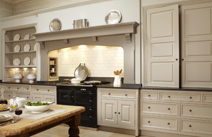
This Classic Kitchen by cabinet maker, Martin Moore, is a very accurate representation of that coveted English kitchen look.
Source: Martin Moore
This post is not about creating an old world English kitchen. Instead, it’s about exploring what leading kitchen designers across the pond are doing for their clients right now. Consequently, while some of the design features that I’m going to share with you today are classics,…others may surprise you. In general, I would say that they are celebrating a minimalist approach to design at the moment. Interestingly, many of these kitchens are so simple, that a different selection of bar stools, light pendants, and a few accessories could push them more modern or more rustic depending on the items chosen. Despite the bare-bones trend, our mutual appreciation for texture, character, and form are still present. We also share a love of similar colors for cabinetry. Although white kitchens are not as dominant as they are in our market, I still see a lot of off-white & cream kitchens, as well as moodier colors, like taupe, black and forest green.
(There are a few companies featured below who hail mostly (or entirely) from Ireland. While these Irish kitchen companies may have some subtle differences in their particular market, from our perspective, they are very similar. Consequently, I’ve decided to include them. The heritage of craftsmanship and adherence to certain design principles are certainly very similar.)
Ingredients for Creating an English Kitchen
1. THE CLASSIC ENGLISH MANTLE
When I think of a traditional English kitchen, the first thing that comes to mind is the classic mantle above the range. Most of the imagery that I’ve come across for these major style-setting brands showcase an exceedingly simple design. They keep it very simple, which I believe is that “nod to the past” that I mentioned earlier. Since kitchens in traditional English homes were the realm of the staff, everything was done for the sake of function, rather than aesthetics. A traditional mantle and hearth, therefore, was a common feature. Simple brackets or corbels would support a wide shelf, mounted on a chimney breast above the cooking area. Contrast that with our desire to create unique range alcoves and interesting hood designs.
An interesting side-observation about the range area for many of these new-build English kitchens…mercury glass or antique glass seems to be having a bit of a moment.
Source: Humphrey Munson
Source: Martin Moore
Source: DeVol Kitchens
2. AGA, THE ENGLISH COOKER
An AGA is another feature that you would expect to find in a traditional English kitchen. If you’re not familiar with AGA, it is a classic British brand of cast-iron ranges, which are traditionally left on all day/night. This was a useful feature in cold, drafty homes in the past. Although some American homeowners have sought out the British brand (available here in the U.S.) for this charming feature, AGA also now offer a cast-iron range specifically for the U.S., which does not need to be kept on at all times (however, if you turn it off, the ovens can take up to two hours to heat back up). The cast-iron 3 oven model is approximately 39” wide. There is also an add-on unit that offers gas burners and two additional conventional ovens (one of which is convection). This combination creates a 63” wide cooking experience with all of the heritage of the classic cast-iron AGA, along with the American expectation of gas burners and electric ovens. Visit AGA if you’d like to learn more about using one for your new kitchen.
Historically, cream-colored AGAs were the English classic, so I was surprised to see so many black ones featured in the images below.
Although AGA is a prevalent feature of a traditional English kitchen, I still observe a lot of French ranges as well (La Cornue, Lacanche, etc.). So if you’re struggling to create an authentic English kitchen look, but you also love french ranges, I think you can take some artistic license here.
Source: Thomas Ford & Sons
Source: DeVol Kitchens
Source: Chalon
3. OPEN STORAGE
Open shelving on the wall instead of rows of upper cabinets is as prevalent in the U.K. as it is here. However, I think that it’s more of a recent trend or movement here, whereas I think they’ve embraced it long ago for its authenticity. I also observe a lot of islands with open storage below, which is a bit of a departure from our market. Historically, the kitchen island wasn’t much more than a large work table in a kitchen, so this is also an appreciable difference. While working out a design to allow for the plumbing and electrical requirements to the island can be a bit of a hurdle, I adore islands that have a more furniture look - often with legs and lots of open shelving.
Source: DeVol Kitchens
Source: Humphrey Munson
Since the kitchen island is really an evolution of a working table in a traditional English kitchen, it makes sense to incorporate that table feeling into the design by using legs and open shelving when possible. Kitchen Design by Artichoke Ltd.
Source: Artichoke Ltd.
4. STAND-ALONE HUTCH
There is a greater appreciation for the look of a stand-alone hutch or kitchen dresser in England. I have always been a fan of this idea, but confess that I have been pulled away from it in recent years. Given the right room configuration, this idea can prevent the wall-to-wall cabinet look that I dislike. I particularly love the one below, which has employed the use of bi-fold doors. When extra workspace or serving space is needed, the doors can be folded back out of the way. This concept could be a great use of space near a breakfast table as well.
Source: Martin Moore
Source: Woodale Designs
5. ROUNDED CORNERS ON CABINETRY
I follow a lot of British cabinet manufacturers on Instagram and let me tell you…I see A LOT of rounded corners and semi-circular cabinets in their images! I find this very interesting, and I don’t know exactly why this came about. Has it been popular in their past? Is this a precursor for us? I always think it’s nice when you can soften the lines of cabinetry a bit. In a kitchen design, there are so many hard lines & right angles, as well as hard surfaces. So this is a fun detail, in my opinion, when used sparingly. With too many rounded corners, it makes the kitchen look like it belongs on a yacht! Take a look at the kitchen I designed below (4th image).
Source: Hayburn & Co.
Source: Mark Wilkinson
Source: Hayburn & Co.
While this kitchen was designed for a family in South Carolina, it features the British manufacturer of cabinetry, Clive Christian. Just like the other English brands that I’m showcasing, Clive offers a selection of rounded cabinetry, which I used to distract the eye from the quirky shape of this room.
Source: Heather Hungeling Design | Willow Lane Project (Clive Christian Cabinetry)
6. ROUND CHOPPING BLOCKS ON THE ISLAND
In keeping with their love of curves, I also noticed that they love to incorporate round chopping blocks. Not only is it another way to incorporate a wood tone into a painted kitchen, but again, it offers the eye something other than recto-linear lines everywhere. I particularly love the image immediately below because they repeated the wood tone with a sliding wood board over the sink and again with the interior of the hutch.
Round chopping blocks are prevalent in English kitchen designs - usually integrated into the island design. I love the curve that it adds to the island. Kitchen by Mark Wilkinson.
Source: Mark Wilkinson
Source: Tom Howley
7. WOOD CABINETRY MIXED WITH PAINTED
The British have a high appreciation of wood-stained cabinetry, most notably walnut and oak, incorporated into their kitchen designs. While we share a love for walnut here, we haven’t used oak very much over the last two decades. However, I think that is starting to change. Companies like Clive Christian and Christopher Peacock both have a healthy appreciation for oak in traditional bespoke kitchens. When oak is acquired from managed growth resources, it has a straighter grain and is quite a bit more sophisticated looking than builder-oak cabinets from the 80s. We must try to wipe the memory of those horrible, cheap, orange cabinets from our collective minds so that we can embrace quality oak, which is just beautiful!
Source: Martin Moore
Source: Smallbone of Devizes
8. DOOR STYLES ARE EXCEEDINGLY SIMPLE
With very few exceptions, the door styles are Shaker or contemporary Shaker (wider rails and stiles). The top drawers are almost always slab drawers, meaning no embellishment of any sort other than the hardware. The beaded, inset-door style is still the gold standard (see picture below), although there are some more streamlined styles without any bead whatsoever. The latter gives a cleaner look, but the bead is a hallmark of quality, as only higher-end cabinet makers are capable of doing that well.
Source: Martin Moore
9. WOOD SERVING TRAYS INTEGRATED INTO CABINETRY
What to do with those pesky little narrow bits in your cabinet design? Too narrow for a pull-out of any type…but yet too wide for a blank or filler. So how about this clever idea? Custom wood serving trays, neatly integrated into your cabinetry with smart little hand cut-outs or leather handles. While these trays will be a bit on the heavy side (being made of high-quality wood), they do look gorgeous, don’t they? I see a lot of these lately, and they are almost always in a contrasting wood finish. So if you’re looking to use a few accents of wood in your painted kitchen to warm it up a bit, this would be an excellent way to go.
Source: Humphrey Munson
10. AN OCCASIONAL PEDIMENT
When I first began started my career in the kitchen biz (around 2002), there were a few lovely clients who were willing to indulge in classic details, such as pediments. But for the past several decades to even mention the idea of a pediment would firmly place me in the “uncool” department. So I was thrilled to see a few Brits embracing these classic details. I appreciate the minimalist nod to it in the images below, rather than a heavy, ornate pediment. Maybe now that the pendulum is starting to swing back towards traditional design again, we’ll see a few of these pop up in kitchens here.
Source: Teddy Edwards Kitchens
Source: Plain English Design
11. YES…PLATE RACKS ARE STILL A THING
Source: Chalon
The image below is from one of my projects, but again, featuring the British brand, Clive Christian. Plate racks have always been a highly coveted feature of a Clive Christian kitchen.
Source: Heather Hungeling Design | Woodhill Avenue Project (Clive Christian cabinetry)
12. LARDER LOVE
Before the development of refrigeration, cold larders were used to store food at cooler temperatures. They were often vented outside, and a marble slab was used to keep cheese and butter cold. There is now a resurgence of this concept in the U.K. Seen as a more economical and greener alternative to storing certain foods. Plain English Cabinetry (image below) is offering larders to suit this new trend. However, when not used for cold storage, larders are still a welcome addition to the kitchen. Since many homes are older, there is not always a way to incorporate the large walk-in pantries that we enjoy here in the U.S. Enter the English larder cupboard. Often nestled into a corner of the kitchen, the larder can organize and house a great deal of dry and canned foods. Sometimes a series of them can be used to create larger capacity or to offer the joint function of tucking away the coffee maker and small countertop appliances. When I have incorporated these into kitchens for my clients, they have loved the drawer feature the best. Drawers are so very helpful when organizing a pantry and most of us don’t have them in our walk-ins.
Source: Plain English via PureWow
Source: Hayburn & Co.
Source: Tom Howley
13. CONNECTION TO THE GARDEN
Considering that they have such a short growing season in the U.K., I’ve always been awestruck by how much Brits love their gardens. As an avid gardener myself, I cringe at the thought of how much work they must put into it for such a short payoff period. But I guess that the glory that results is all the sweeter for it.
With the cool, rainy, British climate, sunlight is needed anyway that they can get it. So converting large windows into sliding or fold-away glass doors to directly connect to the garden is a no-brainer. I love the indoor/outdoor feeling this brings to the kitchen. With our above-grade basements, that sense of connectivity between our main living areas and our yards is often sacrificed. I find myself envying them when I look at these images - despite their harsh winters!
Source: Mark Wilkinson Furniture
Source: Tom Howley
Source: Martin Moore
While British brands, such as Clive Christian and Smallbone of Devizes, set up shop on our shores a long time ago, some of the other cabinet makers are now setting their sites on the American market as well. DeVol Kitchens and Plain English Designs are two of the most recent additions (available in NY). It will be interesting to see if the trend continues and if the uniquely English perspective will influence our own!


Do you hold on to images of kitchens designed 15 years ago and sigh wistfully at the beautiful cream kitchen cabinets? Well, I have good news for lovers of cream kitchens everywhere…I’m forecasting a return of the warmer, creamier colors of our past! With the continued “warming” up of the gray trend, the conditions are perfect for cream to finally make a comeback.